Interpreting Kagi Chart Patterns for Investment Decisions
Trading the financial markets is exhilarating. It’s a world full of challenges, risks, and exceptional rewards. However, breaking into this intricate industry requires tools for technical analysis.
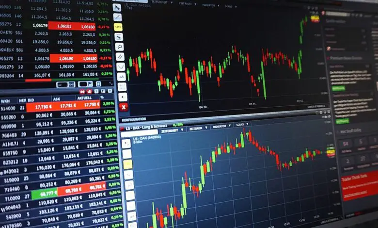
One tool that stands out as brilliant and unique is the Kagi chart. Initially used by the Japanese over a century ago, they have become increasingly popular. Its simple yet innovative approach offers a wide-angle view of market realities by disregarding time and focusing on substantial price changes.
Keep reading to learn more about Kagi charts for investment decisions.
Understanding the Basics of Kagi Chart Patterns
The Kagi chart, unlike the traditional bar or line charts, draws price movements without the parameter of time. This omission allows the trader to solely focus on prices. Moreover, a Kagi chart simplifies market noise, allowing users to identify vital market trends.
Each line on a Kagi chart represents a consistent price movement toward one direction, and these lines can turn only when the price reverses direction by a specific amount. Furthermore, the thickness of the line changes as well when the price surpasses a previous high. This Kagi chart can provide traders with unique perspectives.
A better understanding of complex finance instruments like these can help traders quickly study price patterns and crucial shifts between supply and demand. Allowing investors to forecast future price movements with a higher degree of accuracy.
Lastly, knowing the basics of Kagi charts benefits a trader as it provides a selective focus on significant price moves. They can ignore the minor fluctuations, which may distract from the bigger picture. Thus, Kagi charts can prove a valuable addition to a trader’s technical arsenal.
Identifying Bullish and Bearish Trends with Kagi Charts
Identifying bullish and bearish trends forms the core of successful trade execution. A Kagi chart’s design can be very helpful in this regard. A thick line (yang) represents the control of bulls, i.e., an uptrend, whereas a thin line (yin) indicates a downtrend under the bear’s control.
When a Kagi line changes from thin to thick, it could indicate a bullish signal and a change from thick to thin could potentially suggest a bearish signal. Traders could use these signals as entries and exit points in a trading strategy.
Moreover, Kagi charts can further assist in identifying whipsaws and false breakouts, which frequently occur during market turnarounds. Grappling with these types of false signals efficiently can drastically improve a trade’s success chance.
The unique representation of price trends offered by Kagi charts can facilitate traders’ detection of bullish and bearish market trends, smoothing the decision-making process.
Navigating Common Kagi Chart Formations
Unlike other charting methods that give equal weighting to each time frame, Kagi charts only change direction when a minimum price variation (the “reversal amount“) is met. This difference helps filter out market noise, capture significant trends, and potentially identify lucrative investment prospects.
Widely utilized Kagi chart formations such as Shoulders, Waists, and Multis can be interpreted to form different strategies. The “shoulder” signifies a potential change in the price direction, whereas a ‘waist’ refers to a sideways price phase.
Identifying these common formations can prove crucial in developing robust trading strategies. For example, monitoring and entering at the shoulder could allow a trader to capitalize on a possible change in market trend.
Furthermore, when combined with other trading tools or charts, these Kagi chart patterns can provide a trader with additional confidence in their investment decisions. Therefore, it’s vital to understand how Kagi chart formations can be effectively used to navigate trading strategies.
With a solid understanding of these Kagi chart formations, investors can dramatically improve their decision strategy, reducing risk and maximizing returns.
Overall, Kagi charts have proven to be a robust tool in a stock trader’s arsenal. Whether you are a newbie or an experienced trader, they offer a clear, concise view of market dynamics, enabling traders to make informed decisions. It’s time to leverage the power of Kagi Charts and navigate the twists and turns of financial markets more confidently and successfully.